Crash course: Vision Pro for Devs (Part 1)
Vision Pro is an unusual opportunity. As an incumbent, multi-platform developer tools vendor, Apple has a wealth of existing assets devs already know how to use. The learning curve for producing unique experiences for this platform is much shorter for existing iOS and Mac developers than you’d expect for something so groundbreaking.
At the same time, this is a whole new approach to computing productivity. There are important considerations that didn’t apply to fixed, flat screens in the hand or on the desk. Here are my notes on Apple’s resources for this transition, with links to go deeper as needed.
Avoid discomfort and puke
We use our vision to understand our body’s existence in reality. The power of high-quality pass-through video in Vision Pro means that the user can be convinced of impossible situations that are unsettling or worse. We should avoid that.
In depth: Design Considerations for vision and motion (Apple)
- Objects need depth cues: Ways for the user to understand where an object is supposed to be positioned in a 3D scene. Without depth cues, like lighting and shadow, the eyes are uncomfortable.
- Prevent fatigue: The eyes should scan to read, not the head. Too much head motion leads to discomfort and fatigue. Eyes can easily look downward or left-to-right. Looking upward costs more. Extended content should be centered to prevent too much effort expended to see it all.
- Provide stability: Anchor the contents of your application in the world, not the gaze. Head-locking content—making it follow the user’s gaze—should be avoided, except for small windows, as in a HUD.
- Motion safety: If you need objects to move toward or away from the user, make them transparent during the move. Being able to perceive the stationary objects behind the moving object prevents the user from feeling as though they, themselves are in motion.
UI Basics
Apple’s UI design for Vision Pro will feel familiar to anyone who already uses their products.
Still, some things have changed:
- There’s no light or dark mode. Instead, the Glass UI appearance makes the UI look appropriate in whatever setting the user is sitting in.
- This is an ultra-high resolution platform. It’s time to replace any bitmap image assets with vector alternatives, otherwise your UI is going to look bad.
- Hover effects are the core UI affordance for Vision Pro. Users select UI elements by looking at them, then confirm their selection with a hand gesture. Hover effects confirm an element is selectable/selected.
- Ornaments allow you to attach additional accessory views at the edge of a window.
SwiftUI for Spatial Computing
If you’ve been investing SwiftUI on an individual, team or project level, those investments just yielded a whole new platform you already know how to build for. You might even have existing code that’s not a huge lift to port over.
Still, there’s plenty of new stuff to absorb.
In depth: Meet SwiftUI for Spatial Computing (Apple)
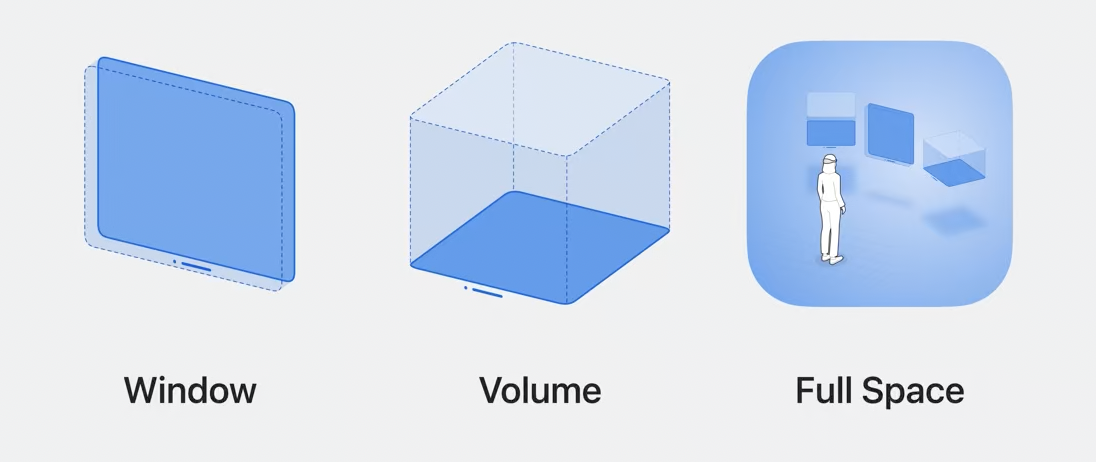
Window, Volume, Full Space

You can build UI as a flat plane, as we have been doing since the 80’s. This is a Window. While the above considerations for Vision Pro’s interaction scheme still apply, this will be the simplest and most familiar approach to developing UI for the platform. Apps that rely exclusively on this approach will likely be transitional, the way early television simply broadcast the performers of radio plays until new formats, like I Love Lucy, gave the medium its distinct advantage.
You can build UI as a distinct volume of space the user looks in on, like a terrarium or diorama. This is a Volume. This is a departure from what most devs know how to do, and Apple has created a bridge between SwiftUI and RealityKit to make the developer experience more attainable, called RealityView.
Finally, you can create spaces that immerse the user. These are Full Spaces. Full Spaces allow a range of immersion styles: they can suck you in completely, or mix content with your existing surroundings.
Working with 3D
- USDZ is the 3D file format that will give you similar behavior to dropping image assets into your project
- Apple has provided their own 3D scene editor as part of their developer tools suite: Reality Composer Pro. While it won’t have the same depth as more mature, competing tools for 3D asset authoring, it’s available free and it’s optimized for visionOS development workflows.
- Attachments allow the blending of 3D assets in RealityView with 2D SwiftUI content.
Up next
Working with 3D used to be a specialization. But for visionOS developers, it’s about to be an everyday fact of life. Next we’ll dig deeper into RealityView and other tools for presenting interactive 3D content.
Learn more about the move to Spatial Computing
Crash course: Vision Pro for Devs (Part 1)
This is a whole new approach to computing productivity. There are important considerations that didn't apply to fixed, flat screens in the hand or on the desk.
Vision Pro is not the iPhone
The appropriate historical parallel is the early days of the Macintosh and CD-ROMs. Except... there's more internet in the mix.
Economics of Vision Pro Development
Unlike previous entries to the space of augmented or virtual reality, Vision Pro ships with a raft of libraries and frameworks for every sort of computing productivity application. Not to mention millions of developers who already know how to use them.
Why 'Spatial Computing'
Apple put us on notice last year that we're on the threshold of a new computing paradigm. The era of ostrich malarkey is at an end.
Leviathan Wakes: the case for Apple's Vision Pro
After years of quiet work beneath the surface, Apple's AR project is upon us, barely at the border of the technologically possible. It's our best chance yet to explore a future beyond fixed displays.